Noiram Cafe branding
Noiram Cafe branding
Noiram Cafe branding

About the project
Noiram Café is a small, family-owned French coffee roastery rooted in fairness, transparency, and deep respect for the environment. The founder sources beans directly from farmers, roasts them herself, and is uncompromising when it comes to sustainability.
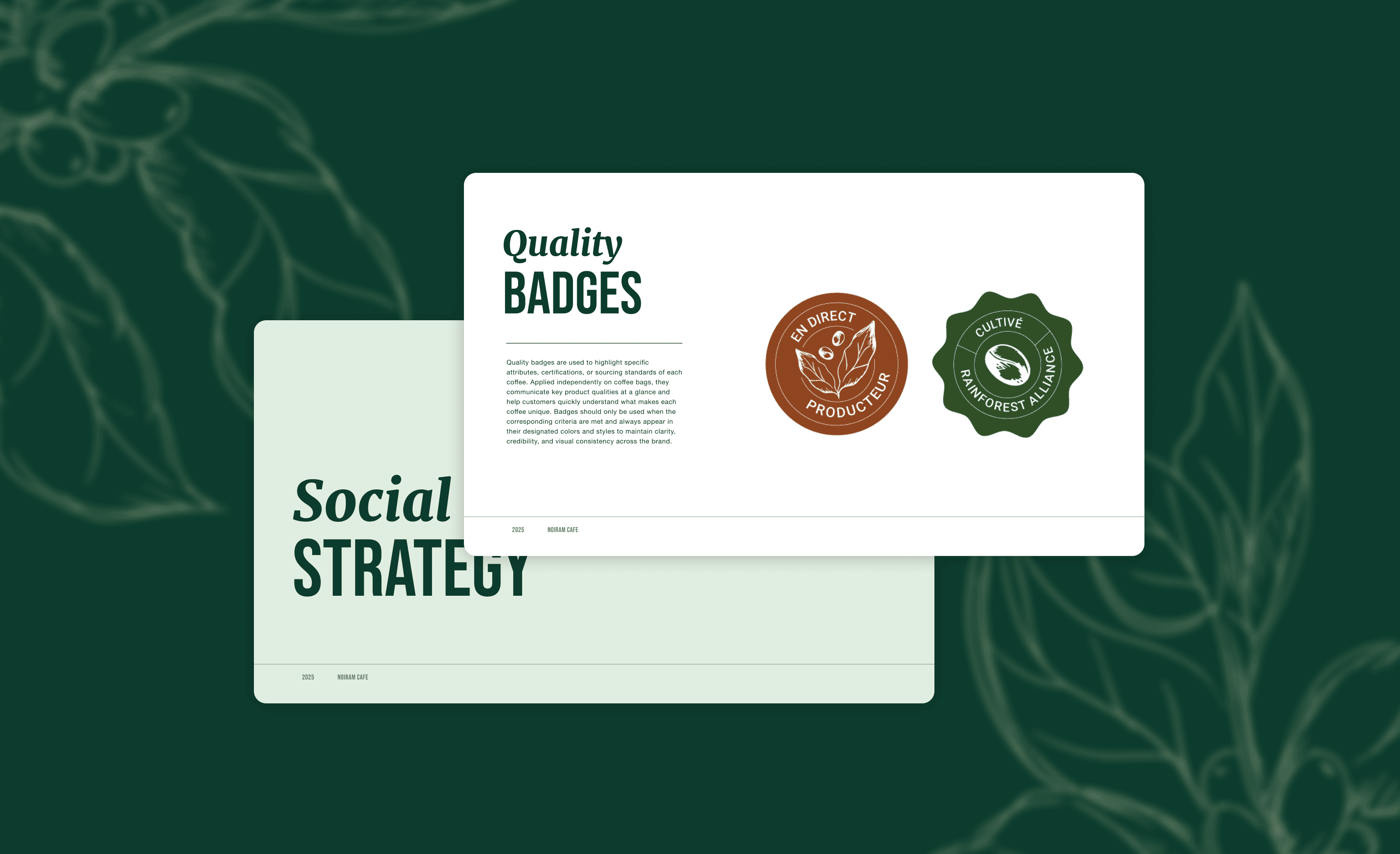
I originally designed the brand identity in 2020, and revisited it in 2025 with a refresh focused entirely on real-world constraints. The key requirement was clear: all packaging had to be truly recyclable - not “eco-looking,” but genuinely low-impact. That meant working with biodegradable Biotre bags, no full-print packaging, and implementing stickers as labels (that can be easily removed).
Instead of fighting the limitation, I embraced it. I designed small, eco-paper label templates that could be applied on the bags. Earthy, simple tones and hand-drawn illustrations were the key of this band identity.
Each label functions as a modular system, easy to print independently and reuse across different origins, while maintaining a consistent and recognizable brand language.
Beyond packaging, I delivered a complete brand ecosystem including:
CI manual
Logo design
Illustration system
Packaging & label templates
Stickers, vouchers, business card
Stamp card
Product photography
Social media visuals
BUSINESS
Brand identity
YEAR
2025
About the project
Noiram Café is a small, family-owned French coffee roastery rooted in fairness, transparency, and deep respect for the environment. The founder sources beans directly from farmers, roasts them herself, and is uncompromising when it comes to sustainability.
I originally designed the brand identity in 2020, and revisited it in 2025 with a refresh focused entirely on real-world constraints. The key requirement was clear: all packaging had to be truly recyclable - not “eco-looking,” but genuinely low-impact. That meant working with biodegradable Biotre bags, no full-print packaging, and implementing stickers as labels (that can be easily removed).
Instead of fighting the limitation, I embraced it. I designed small, eco-paper label templates that could be applied on the bags. Earthy, simple tones and hand-drawn illustrations were the key of this band identity.
Each label functions as a modular system, easy to print independently and reuse across different origins, while maintaining a consistent and recognizable brand language.
Beyond packaging, I delivered a complete brand ecosystem including:
CI manual
Logo design
Illustration system
Packaging & label templates
Stickers, vouchers, business card
Stamp card
Product photography
Social media visuals
BUSINESS
Brand identity
YEAR
2025


Project outcomes
A key requirement of the refresh was full autonomy for the owner. Coffee origins and blends change frequently, so every label element was designed to be easily editable and reusable without design support. The system works as a set of simple templates that she can update, print, and apply independently - ensuring flexibility, consistency, and long-term usability while keeping production local and low-impact.


2025
Webflow design
A full visual and digital refresh for Bots & People - from color and typography overhaul to Webflow website design and copy. Modern, cohesive, and human-centered.
Web design / Copywriting

2023-2025
Performance marketing assets
Paid performance assets for Meta - static and video ads designed for testing, scalability, and authenticity.
Ads / Video / Animation

Interested in working with me?
I design human-centered brands and digital experiences, bridging strategy and execution with a hands-on approach.
Interested in working with me?
I design human-centered brands and digital experiences, bridging strategy and execution with a hands-on approach.
Interested in working with me?
I design human-centered brands and digital experiences, bridging strategy and execution with a hands-on approach.